


Quenut is a Mexican superfood brand specialized in developing products for people who love sports and well being. They have two main lines: sports nutrition powders and adaptogen supplements.
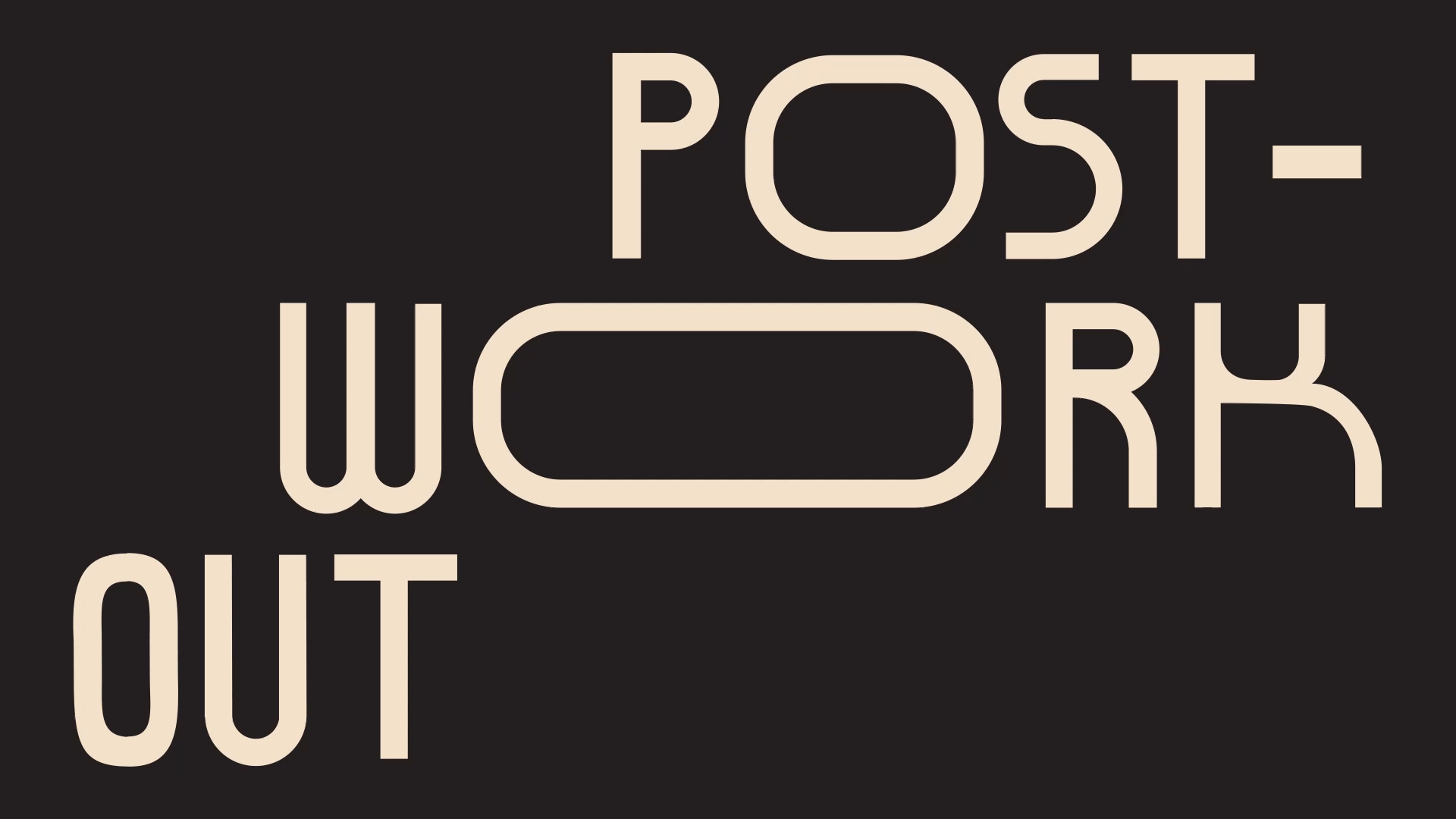
The challenge for this project was to make a strong brand that could be easily applied to each product, keeping unity and coherence between all of them. We accomplished this by using a curved black block that displays the product information, a custom typeface and a detailed illustration by it's side. The custom typeface for the brand is used in the logotype and the product title. The characters are variable, meaning they may condense or expand in width. This way the typeface accomplishes to reflect movement and physical activity while giving the brand a unique and edgy look.
For the illustrations we made two styles for the two product lines. In sports nutrition they are nature oriented and show different characters who lead an active life. Each product has a different scenery depending on the intensity rate and stage of exercise the product is focused on. For the supplements, they portray in a detailed style the different fungi variations used in the pills.
Art Direction
Mariela Mezquita
Designers
Harumi Tanimoto
Daniela Martínez De Castro
Yareli Denis
Motion
Luis Romero Sosa
Photography
Ximena F.T.
Client
Quenut Smart Foods


+


