Tierra Viva is a space dedicated to well-being and harmonious coexistence between human beings and nature that offers yoga retreats, the sale of locally grown and harvested organic products, and glamping service, all under the motto of creating community and connections.
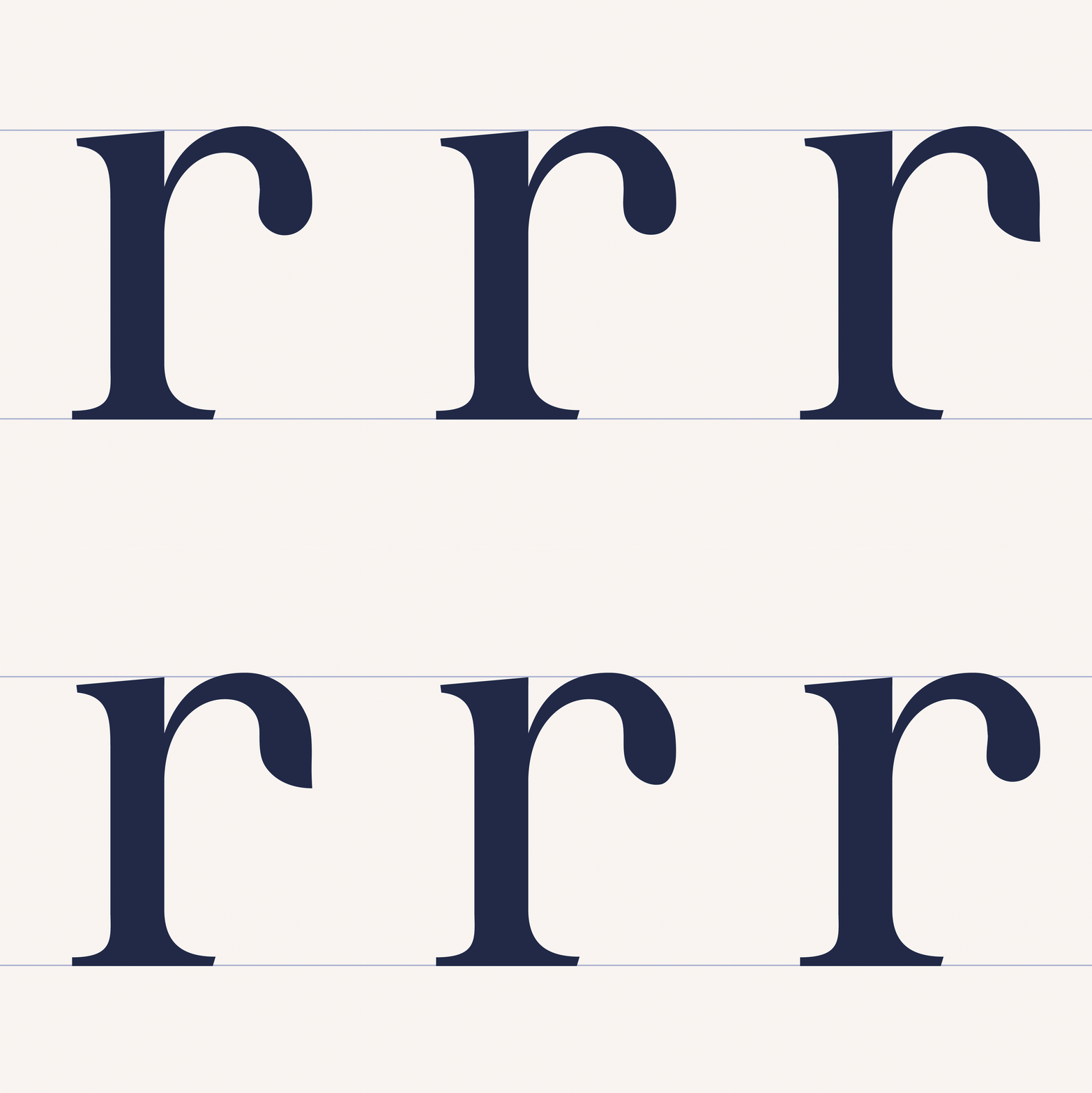
The wordmark is a custom-made typeface with adaptations to its serifs to give it a modern touch without losing its classic essence. The icon is a redesign in which the client wanted to keep most elements. We made a polish where the flower becomes a symbol of everything that germinates and unites new ways of generating life in the same space. For the illustrations, we took inspiration from different elements of the environment: flowers, bees, horses, chickens, pigs and dogs are the characters that make up the graphic system, where the style refers to manual and artisanal processes. Last but not least, the hospitality elements had to respond to the care of natural resources and respect for the environment. For this reason, we used natural paper and reduced the print area as much as possible.
Art Direction
Mariela Mezquita
Designers
Valentina Villa
Leslie Piñón
Illustration
Harumi Tanimoto
In Site Photography
Camila Rodríguez
Set Photography
Ximena Fernández


